Showing posts with label design. Show all posts

SKATE BREAK / ZENGA BROS

Zenga Bros, a Vancouver-based, multidisciplinary creative duo, in collaboration with professional skateboarder Andy Anderson, created an ingenious furniture collection with a rebellious spirit - Skate Break. The collection consists of five unique pieces that can seamlessly transition between functional office furniture and skate-ready ramps. Each piece invites a different use, expanding the furniture’s utility beyond a single, static purpose. In the accompanying short film for the Skate Break collection, Andy Anderson showcases the skateable furniture pieces in action, illustrating how everyday items can redefine form and function with thrilling, playful results.

With this furniture collection, the Zenga Bros challenge us to rethink the spaces we inhabit and the way we design them. This approach aligns with architect Bernard Tschumi’s theory of Event Architecture, where space is not merely a container but an active participant in the experiences it hosts. Tschumi’s concept of “transprogramming” — fusion of two programs, regardless of their incompatibilities, together with their respective spatial configurations — mirrors the Zenga Bros’ innovative approach of blending workspaces with skate parks, letting two seemingly incompatible functions share a dynamic relationship.


In Tschumi’s words, architecture should be more than just form or function; it should be about creating “conditions” that encourage diverse and unexpected uses. The Skate Break pieces are exactly that — furniture that responds to both the need for functionality and the desire for play, creating moments of surprise and non-conventional interaction within the everyday.

The Skate Break furniture collection concept also finds a compelling resonance in Bobby Young’s article “A Skateboarder's Guide to Architecture or an Architect’s Guide to Skateboarding”, which positions skateboarders as some of the most functional, innovative users of urban spaces. Young argues that skaters, like architects, question the relationship between form and function, yet do so in a direct, physical manner. While an average person engages architecture and urban space at only one level and sees a bench merely as a place to sit, a skateboarder sees a set of opportunities: slides, grinds, or foot plants. Skateboarders are “purist” users of architecture, as Young notes, bending traditional uses and engaging the urban environment in unconventional ways. Similarly, Skate Break invites us to question the boundaries of work and play, practicality and imagination, as each piece blurs the line between art and action, utility and excitement.

Through Skate Break, the Zenga Bros and Andy Anderson are not just designing furniture, they’re redefining the relationship between function and form, making it easier to challenge conventional perceptions of space and purpose as these products become more accessible. Imagine a kindergarten furnished with these objects—instilling from an early age a sense of creativity and possibility, and reshaping how everyday environments are experienced and understood.
These multi-functional, skateable objects represent a call to action — a chance to see potential in the mundane, to engage with our environment on multiple levels, and to celebrate the playful possibilities that lie just beneath the surface of the everyday.


ALLURE AND IMPACT OF A COLOR

Tracing back through time, pink's journey unveils a fascinating narrative. It plays a significant role in shaping cultural norms and societal expectations, particularly concerning gender. Initially perceived as a symbol of masculinity in Western cultures, it gradually transitioned to symbolize femininity by the mid-20th century. Contemporary movements challenge these stereotypes, advocating for pink's inclusivity and versatility in self-expression.

Pink's influence extends far beyond its aesthetic appeal. In the realm of art and design, pink serves as a powerful tool for communication and expression. Artists and designers harness its vibrancy and versatility to convey myriad emotions and themes, ranging from innocence and romance to boldness and rebellion. From iconic artworks to modern-day fashion statements, pink continues to captivate audiences with its visual impact. As we look ahead, the future of pink appears promising and dynamic. With evolving cultural attitudes and societal norms, pink's significance is poised to transcend boundaries and inspire diversity in innovative ways.


The article A deep dive into the color pink by Liz Huang landed in my inbox as a part of the Creative Mornigns newsletter. It offers an interesting overview for understanding the color pink's history and symbolism. I put a metaphorical pin into a particular anecdote described in the article exemplifying a fascinating intersection of art, freedom, and the debate over public and private property:
// In 2014, Surrey NanoSystems (SNS) invented the blackest color in the world, naming it Vantablack. They promptly managed to anger the entire art world by granting divisive artist Anish Kapoor exclusive creative rights to the substance.
Artist Stuart Semple responded in a conceptual and practical way by inventing the “Pinkest Pink” and giving all people the right to purchase and use the pigment — except for Anish Kapoor. In order to purchase it, you are required to assert that you are not Anish Kapoor and you will not give the pigment to Anish Kapoor.
Semple talked about selecting the color for its overt sexuality. “Pink is a really powerful color and this particular pink is extremely vibrant, so it felt like the logical choice to make the point I was hoping to make,” said Semple. He used the color to protest elitism, commercialization, and privatization, ultimately earning him the nickname “The Robin Hood of the Rainbow”.
Anish Kapoor did eventually gain access to the color, posting an image to his Instagram account of his middle finger coated in the pink pigment. He was promptly dragged through the mud in the comment section.
Semple followed up with a full series of pigments banned from use by Anish Kapoor, including “the most glittery glitter,” “the whitest white,” multiple Vantablack alternatives, and an even pinker pink. The feud appears to continue to this day. //

Read the whole article at Webflow

WISDOM AND DOUBT / JUHANI PALLASMAA

The theme of this year's Helsinki Design Week is Wisdom. To do this subject honor, HDW's team decided to make sure that the attendants come to the event charged and updated - they are gifting their audience a series of columns that tackle the subject of wisdom written by selected thinkers, designers and creatives that will be published during the following nine months before the event starts.

The first column in the series comes from Juhani Pallasmaa -  Finnish architect, professor emeritus and writer:

// Wisdom is not identical with intelligence or knowledge. It is a hidden mode of creative vision, arising from certain outsideness and distance, combined with an empathic identification with the situation. While knowledge aims at certainty, wisdom is grounded on the acceptance of doubt, uncertainty and the possibility of failure. Wisdom is not necessarily a result of specific education; a fisherman, hunter, farmer or a traditional craftsman can possess remarkable wisdom in his/her work. Knowledge and skills are facts, whereas wisdom calls for relatedness and a distinct humanistic and life supporting perspective. In the post-industrial cultures, broken into countless specializations, we are especially in need of the unifying visions of wisdom. Yet, in our current quasi-rational culture of persuation, insistance and manipulation, wisdom is a disappearing quality.

A wise person keeps him/herself outside of the center of action, as wisdom arises from internalizing and grasping simultaneously large entities and the merging of peripheral and focused attentions. The technologized societies are split into countless domains of expertise, individuals who are assumed to know and master a specific area of knowledge or activity. However, expertise is a focused capacity, whereas wisdom arises from an unfocused and comprehensive understanding. Expertise is valid only within its limited and constrained area, whereas wisdom is the capacity of grasping complex entities, often consisting of conflicting aspects, requirements or dimensions. Most of the seminal societal tasks, such as political decision making, planning and  architecture characteristically consist of conflicting realities, intentions and interests. Situations in real cultural and societal activities merge numerous dimensions of reality and, consequently, they cannot be resolved with intellect, reason and logic. In his inaugural lecture as Member of the Academy of Finland in 1955, Alvar Aalto pointed out the irreconcilable inner structure of design tasks: ”In every case one must achieve the simultaneous solution of opposites. Nearly every design task involves tens, often hundreds, sometimes thousands of different contradictory elements, which are forced into a functional harmony only by man’s will. This harmony cannot be achieved by any other means than those of art”.[1] Aalto´s statement could well terminate in the word , ”… wisdom”.

In the modern world, architecture is usually seen as problem solving; architectural projects are even commonly called ”solutions”. The use of this notion reveals a fundamental misunderstanding of architecture; it does not solve problems, as it mediates our relationship (movements, physical and sensory conditions and mental experiences) with the world, both natural and man-made. It is an irreplaceable mental mediation between us and the world, not a problem to be solved by intelligence and expertise. Indeed, philosopher Maurice Merleau-Ponty argues: ”We come to see not the work of art, but the world according to the work”[2]. This argument reveals the mediating and dialogical essence of artistic works, including architecture.

Joseph Brodsky is critical of our culture of expertise : ”In the business of writing what one accumulates is not expertise but uncertainties”[3]. In the poet’s view, even master craftsmen are engaged in uncertainties rather than expertise. Wisdom acknowledges evolution, processes and change, and contains a temporal judgement that fuses the time perspective in its judgement.  

Knowledge and skills can be taught, studied and learned, but wisdom grows and matures by itself through lived experience. Wisdom is contextual; the wise individual sees the phenomenon in its total context and dynamics. In traditional societies wisdom relied on mythical and symbolic knowledge and magic, while in our self-claimed age of reason, it is an exceptional human gift. It is not a conceptualized and structured mental construction; it is a natural ability to sense the essences and interactions of things. 

Wisdom is usually related with age, as only rich experiences of authentic life and culture can prepare a person or group for the required diffuse attention and judgement. The common view suggests that responsible decisions in demanding situations call for intelligence, but emotive and empathic capacities are more essential. Choices of wisdom are usually based on emotive, not rational certainties. Mark Johnson, another philosopher, claims: ”Emotions are not second-rate cognitions; rather they are affective patterns of our encounter with our world, by which we take the meaning of things at a primordial level [… ] Emotions are a fundamental part of human meaning”.[4]  Wisdom fuses knowledge and emotion, intelligence and memory, reason and vision, certainty and doubt. It also calls for imagination, and, in fact,  it is fundamentally an imaginative skill. But wisdom has also an ethical component, as there is no wisdom without ethical judgement and responsibility. Wisdom is an existential gift, and it is undoubtedly the highest of human qualities. //

[ Source: Helsinki Design Week ]

SAVE OUR SPECIES / LACOSTE

To help fight for world's wildlife conservation, Lacoste partnered up with IUCN (International Union for Conservation of Nature) and created a limited-edition “Save Our Species” collection of polo shirts.

In a simple but powerful gesture, Lacoste replaced it's iconic crocodile logo with a line of emblems featuring 10 of the most threatened species in the world. Each polo shirt, rendered in white, is produced in a limited number of copies corresponding to the remaining population size of the respective species in the wild.
Featured animals are:  Those animals consist of the Vaquita dolphin, Burmese roofed turtle, Northern sportive lemur, Javan rhino, Cao vit gibbon, Kakapo parrot, California condor, the Saola, Sumatran tiger, and the Anegada ground iguana.

// SOS ensures the long-term survival of threatened species, their habitat and the people who depends on them. SOS - Save Our Species channels funds from donors to existing frontline conservation actors working to protect from extinction some of the world's most threatened species of plants and animals. //


THE ISHU 'PRIVACY SCARF' / SAIF SIDDIQUI

// The two-toned geometric-patterned "privacy scarf," invented by 28-year-old entrepreneur Saif Siddiqui, is made up of special light-reflecting crystals that bounces back a flash at the offending camera, rendering pictures dark, grainy, and useless. (It also works with video camera lights.) 

The young creator was quoted as saying the point of his product is to make people more aware of the importance of privacy and allow us to be better in control of it. In the meantime, it's a great solution for stars who don't want to interact with the public

It’s no surprise that high-profile, constantly papped people are drawn to these scarves, but regular folks are buying them up, too. In a world where nearly everything seems to end up on social media, with or without one’s permission, it's nice to have the option to not accidentally be in somebody's selfie. While most of us don't spend our travels trying to avoid TMZ photographers camped out at LAX, there seems to be a growing interest in privacy and the internet, or at least in controlling one's own literal image. //


BLOODROOT BLADES / VAN WYK & SNYDER

//Unlike knifemakers who start by grinding down stock pieces of metal, these highly sought-after blacksmiths go to junkyards and auto yards to find recyclable metals they can manipulate, whether old springs from a 1954 Chevrolet or discarded brass from a shipwreck. They transform selected scrap metals into one-of-a-kind knives so stunning that customers are willing to order the blades more than two years in advance.//

//The word cleave can mean two different things: The word cleave can mean to bring apart as in cleaver" but the word cleave can also mean bring together. And the knife does both of those things at the same time, which I think is an incredible thing. It is cleaving food from itself to cleave people together. And that's a really neat characteristic of how knives work with people.//

WOOL AND AIR COLLECTION / MALAFOR

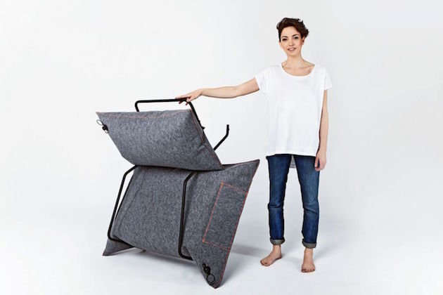
With furniture like this moving apartments would be much more easier. The AIR collection, by polish design studio MALAFOR, consists of a sofa, armchair and three variations of stools. Each piece consists of a metal frame and inflatable pillow, they are light and easy to dismantle. 
Inflatable pillow comes in a pillow cover and both are made of modern textiles. Inflatable bags are very durable and can withstand the pressure of 2 tons. If pierced, they can be quickly and cheaply replaced. The pillow cover is made of an extremely durable, non-flammable and easy-to-maintain textile.


RHEI / DAMJAN STANKOVIC

Hearing the phrase //Panta rhei//, time is amongst first things that come to mind, but when a designer and an electrical engineer join forces, there comes a new way of seeing things: //Never before has a liquid substance been unveiled in its pure, unrefined form and controlled in a manner which allows it to display tangible shapes. There is a middle ground between the analog and the digital sphere, where the rules of mechanics and the laws of nature come together in order to create a liquid illusion reminiscent of a contemporary, digital form.// Behind these words hides Rhei - the prototype of an electro-mechanical clock with a liquid display. The clock has been created by designer Damjan Stankovic as a result of a year long passion project and executed in collaboration with Marko Pavlovic, electrical engineer, and //many other wonderful people.//


LES ANGLES / STEPHANIE MARIN

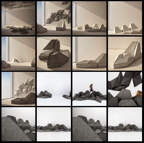
The potential of one spatial configuration to transform according to different narratives is the sphere of scenography. When a collection of seating elements offers such possibility, space planing can turn into //composing of personal landscapes//. Inspired by the waves of the Mediterranean Sea, Les Angles is a set of eight modules with soft polygonal surfaces, that can be easily fitted together to form a paving and cover the surface of a floor, wall or ceiling. The geometry of the modules invites the user to activate his imagination and his body to test the facets, explore their potential and then decide about their function. These pieces of furniture, designed by Stephanie Marin, are not passive and quiet but catalysts for discovery and transformation, they are active participants in constructing and re-defining space.


WALLPAPERING / DEAR HUMAN

Wallpapering are hexagonal wall tiles, hand-made from recycled paper. Except from their decorative potential the they also have great sound absorbing qualities and are easy to install. The tiles are available in a gradation of colours from natural browns to bleached whites and have endless printing options. Paper used for production is 100% post-consumer paper collected from local businesses. Combining different paper types creates all sorts of variations. After shredding and pulping the paper, the production process involves air-release dies and then follows a long drying process. Once dry, tiles are screen-printed.
The tile collection has been created by Dear Human, creative studio founded by Jasna Sokolovic and Noel O’Connell in 2011. // Since then, the studio has developed a coherent body of work in various domains that include public space projects, product design and the applied arts. Their projects offer an alternative perception to overlooked everyday landscapes by revealing the hidden potential of places and objects. After meeting at a residency in Denmark, Jasna and Noel immediately began working on ideas together and haven’t stopped since. The collaboration is rooted in their common interests in craft traditions, sustainable making, and unconventional material (re)use. Noel’s material expertise and attention to detail and Jasna’s improvisational sensibility and exploratory nature have led to a diverse portfolio. //


SMALLER AND UPSIDE DOWN / GODSHAW & HAWKINS

Smaller & Upside Down is a collection of custom designed, 3D-printed lenses that distort views of faces, each in a different way. The fabrication process was developed by Robb Godshaw and Max Hawkins.
// It’s not always easy to predict how a given lens will distort an image. To make prototyping easier, we employed ray-tracing software to see how our lenses might look once printed. Our process used Autodesk T-Splines to create lens geometry, and visualized its effects using Rhino’s raytracing renderer. With this technique, we were able to quickly create lenses that achieve a desired effect. We used the Objet 3D printers at Autodesk’s Pier 9 Workshop to manufacture half of the lenses. They were printed with VeroClear resin to achieve transparency. The rest of the lenses were milled out of acrylic plastic on a 3-axis CNC router. After printing or milling, all of the lenses were sanded to optical clarity. //

EVOLUTION DOOR / KLEMEN TORGGLER

It looks like a normal door, until you touch it. A kinetic art prototype designed by Austrian artist Klemens Torggler evolved into a system called the Evolution Door, a “flip panel door” (Drehplattentür) that uses the force of gravity for the opening mechanism: //The key principle is similar to a balance in the vertical position. In a door consisting of two parts, gravity causes one half to rotate. The physical work is redirected and causes the second, equally heavy door-half to move against gravity. To open and close a gentle touch is all that is needed, after that physics takes over.// Open Sesame!


TRAVEN / CHRISTIAN VIVANCO

// The challenge is not to offer to much design. It is to offer enough so each child can build his own story. //

Tavern is a collection of furniture for children designed by mexican designer Christian Vivanco in collaboration with the brand Nido Muebles. The collection is composed of an armchair, stool and toybox.

[ Sources: dezeen, Christian Vivanco ]


UNIVERSAL TOWEL FOR YOGA, BEACH, TRAVEL, LIFE / THE NOMADIX TEAM

An eco-friendly universal towel, crafted to fit a variety of activities. It is super absorbent, quick drying, slip resistant, anti-microbial, durable, lightweight, packable, perfect size for yoga... Aside the fact so many great features are joined together in just one product, what caught my attention and remained imprinted on my memory is the motto: Own less. Do more. Not only NOMADIX created a product I would buy, they sparked a change of attitude.
[Sources: KICKSTARTER, NOMADIX]


PIRA STOOL / DANILO CALVACHE


Pira Stool is a seating unit created by Colombian-based industrial designer Danilo Calvache. Bared down to esentials, this design conveys the concept of minimalism, but simplicity is not it’s only aesthetic value. A shift in perception reveals a design that calls for action and engagement. The unit consists of only two components: a frame and a seat. Their geometry and particular way these elements are organized form an object that resembles a didactic toy. Metal frame forms a stable base for supporting the bulky wooden seat. The depth of the seat has been deliberately exaggerated and shaped to gradually narrow from top to bottom so it allows the piece to fit into the frame. Depending how you look at it, these two elements can form a stool or may become a didactic apparatus. This design shows how to get more with less.


PIERRE AND THE ALMOND TREE, HOMAGE TO AN ARTIST / TOMAS ALONSO

// Designer Tomas Alonso pays homage to French artist Pierre Leron Lesur, who passed away in the beginning of 2014, with a furniture series that gives a functional dimension to the woodworking technique called “Sylvistructure”.
Baptized with this name over 50 years ago by the artist from Saint Rémy de Provence, “Sylvistructure” is a practice at the crossroads between art and craftsmanship that aims at revealing the natural beauty of pieces of raw wood found along the country roads of France. Pierre developed a particular interest in the nubby branches of the almond tree, which is becoming increasingly rare in Provence.
This practice includes delicate techniques to protect the wood from decomposing, while respecting the unique forms of the raw material.
Inspired by the contorted shapes of Leron Lesur, Spanish designer Alonso - who is making a name for himself with his intuitive and linear objects - adds functional, essential and simple elements that augment and amplify the expressive potential of natural wood. Thus art design series "Pierre and the Almond tree" is born, now on display at Victor Hunt gallery in Brussels. //